How Would We Style The Oslo Hotel? | Fontaine

Rich in history, the Oslo Hotel had admittedly seen better days before The Block whipped up the opportunity to re-do this property.
But with such a rich history, the possibilities are endless! We’re excited to see what the new 2019 season of The Block has in store for the newly acquired Oslo Hotel.
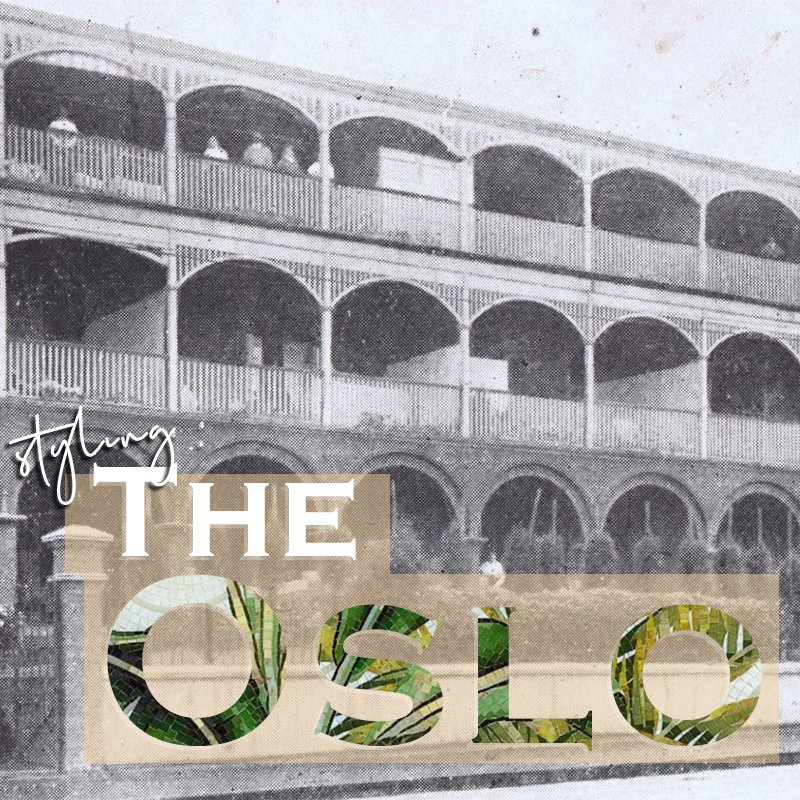
What do we know about the Oslo Hotel? For one, it was built in 1859 and initially housed 5 stately Victoria homes before becoming a hotel. We also know that there was a piece of the façade, which was later added, that was heritage listed, however since the purchase, The Block had sought permission to remove this piece and were approved.
 Image: Domain.com.au
Given that the property was built in the 19th century, the architectural style is Victorian which is why the façade has a uniform design. Buildings during this period featured symmetrical layouts and facades as well as arched roofs which generally leads to a veranda on the façade. Alongside its exterior, as the housing developed in Australia, verandas became a more popular addition as a way of shading houses. Known as Filigree, from the mid-19th century, this became more apparent on properties and has become one of Australia’s strongest developed features of architecture. The most iconic feature of the Oslo property is its façade with gorgeous arches giving it its signature look.
 Image: Domain.com.au
The hotel was influenced by the Mediterranean Revival Style which has similarities to the design of the Oslo. It pays tribute to European architectural styles, which is where arches are evident, and channels symmetrical facades, wood balconies and lush gardens. The Block has already completed the painting of the exterior in a dark, warm grey which embraces the current relevance of design in the Australian market, especially in Melbourne. With that in mind, the fun begins with styling the interiors! For an eclectic approach to the Oslo, we’d channel The Beverly Hills Hotel as inspiration for the revamp. As the outside is relatively simple, The Beverly Hills Hotel ignites a design flair. If we were to style a restroom and bathroom, picture tropic wallpaper with bold accents and gold fixtures. Deck out the space with a substantial amount of greenery. To grab inspiration from other areas, Palm Springs and eclectic din ers all share similar aesthetics that we believe would suit the space of the Oslo. Check out our moodboard of items we’d include.
For our restroom, we’ve chosen a vibrant leaf tile mosaic paired with a subdued pink terrazzo floor tile that gives enough of a colour statement. Terrazzo was first introduced into western design in the 1890’s and honours the period of the time the Oslo was built. The natural timber 900 Paloma vanity would float snugly in the room yet still would be a statement enough for the small space. Pairing rounded products harmonises the restroom whilst keeping relevance to the current design styling within the Australian market such as a generous round mirror and contemporary toilet suite. Top off the space with a humble sized cactus and you have a little slice of Beverly Hills in your home.

Fontaine Industries bathroom, kitchen laundry suppliers
A bigger bathroom means bolder design opportunities! Following a similar style to the restroom, (because at the end of the day there needs to be some sort of flow throughout your home) we’ve opted for a different type of tile mosaic but following the same vibe. Perfect for a statement wall for your shower space, we’ve opted for a tropical essence inspired by the flora you can find at the Beverly Hills Hotel. To finish the space off, we’ve paired the fixtures with our Ariella brushed gold range. The grand Ariana in 1700 invites an oasis element paying tribute to the Palm Spring ambiance. Matching the restroom, we have the Paloma floating vanity in the proud 1500 sporting his-and-hers basins for ultimate luxury. Keeping relevance, we have the same terrazzo tiles as the restroom. These inspirations are ultimately giving you a home-away-from-home feeling in the comfort of your own home!
For our second style, we’d channel a little more local. In the surrounding areas of St Kilda, there are many buildings to grab inspiration from. As the architectural style is Victorian, many properties still embrace the heritage of the design style. For example, café in Armadale, MOBY, features arches of the property where a bay windows have been installed into the existing property as well as painted in a warm grey colour. Making the most of the property’s history is, in our opinion, a great strength. To keep purpose of the current design trends, we would style the interiors in a modern but classic way.

Black bathroom fixtures and tapware is an edgy addition that pairs well with the exterior of the building. Using a shower screen like the Hamptons or black Long Island is a statement in itself but also pays homage to the typical 18th century aesthetic of using wrought iron fences, like the one that can be found outside the Olso. Timber caddies also pay tribute to the original façade of the timber verandas with its long lines whilst also being a contemporary addition. We’ve chosen the walnut finish as our timber of choice to give a moody ambiance to the space. Trending right now are sage green tiles which we believe pairs seamlessly with black fixtures and dark products. Terrazzo floor tiles in a monochromatic grey colour add an additional subtle design style letting the products speak for the space.

Fontaine Industries bathroom, kitchen laundry suppliers
We’ve chosen the Lyndon range for our tapware choice. The Lyndon is the perfect balance of strength and delicacy formed with an artistic stature which holds up perfectly with the Oslo. The matt black finish is an added contemporary touch to the space also. Our lighting choices are an ode to the façade of the Oslo, with arch-like shaping apparent in their designs and the gold addition giving it an elegant touch. In-wall toilet suites provide a streamlined appearance without the display of the backing that you find with back-to-wall toilet suites. Paired with a black in-wall flushing button gives a new-age approach to toilet suites and instantly elevates the space. Consider using similar coloured wall tiles and it will become an invisible inclusion to your room.


